Fantasy
Fantasy means 'the faculty or activity of imagining impossible or improbable things'.
Statement of Intent
The theme of this project is 'Weird and Wonderful'. I aspire to obtain a high grade for this project, as I want to show improvement since my 'Campaign Photography' project. I plan on travelling down multiple paths to achieve a highly developed final outcome(s). This journey will include in depth analysis, artists research, high-standard bank of my own photographs, experimentation with editing, and finally, at least five overall outcome images.
For my initial research, I have chosen three photographers who dabble in the 'Weird and Wonderful' world, and two artists who focus on surrealism, which is an inner aspect in the project. The photographers that I have chosen are; Erik Johansson, Tommy Ingberg and Christopher McKenney. I chose Johansson because his style of photography is definitely relevant to the topic. His photographs and edits are superbly well thought out, and they are a definite source of inspiration for my own photographs. Ingberg is an incredibly well talented photographer and graphic editor. I chose him as one of my inspirations because his black and white style is resonating and can be a style I can learn from. McKenney is my favorite photographer from the three I have chosen, as his edits and photos are incredibly done, with many photographic techniques applied to them, such as the rule of thirds, view points and white balance.
For the routes I plan on taking, I can definitely see myself following in the footsteps of McKenney as his style is incredibly relevant to this topic, and he kind of goes along the 'fantasy' route, which I plan on going down. In order to progress, I plan on keeping a complete open and free mindset, as having set ideas and not allowing them to change and develop throughout the project will be dampening to my end result and grade.
For equipment, I plan on using tripods of different variety to create new and unique angles to build a stronger portfolio. This will, if done correctly, can make my overall banks of photos look more professional and sophisticated. I also plan on using all resources at my disposal, for example photo frames, mirrors and of course Photoshop to edit my pictures.
The knowledge that I have acquired from previous projects (i.e. campaign photography), to really boost my final grade and photographs. My analysis for all projects I have done so far have always been strong, and I have no plan to let this one be the exception. All of my analysis will be strong and bold, as this will help make my ideas and intentions clear and to-the-point.
Erik Johansson


I really like Erik's work. I think that he is a brilliant photographer and that his pictures are transcendent. Johanssons use of lighting to illuminate his photographs are inspirational. His use of depth of field to really show off his proportion is amazing, like in the one where he has taken a picture of himself and blurred himself out in the background to draw our attention to main focal point which is his picture. His pictures are kind of like optical illusions, made to trick the mind. His pictures kind of bend reality, like the one where there is the man walking from one room to another in the dead of night, but instead of him walking through a hallway he's walking through an open field. Or how the power cables turn into the guitar strings.
Analysis

The composure in this image is interesting. The light foreground to the dark, gloomy background gives me a sense of mystery and thrill. I think that this is a great weird and wonderful picture, as Erik is showing use his face, but with a Polaroid camera. This image could be possible, if he had taken it facing a mirror, but the fact that in the Polaroid image. you can't see the reflection of the camera, and his facial expression id different. Broken down, this image appears to be taken with a shallow depth of field, most likely a F8.0. The camera and the smaller image is in complete focus, his hands holding the camera are in slight focus, and his face and neck are quite blurred out. The main focal point in this picture is the mans eyes in the Polaroid image, they seem to be staring back at you, I think Erik has done this on purpose to draw us in to the image and give us a sense of wonder as he seems to be staring out at us.
Christopher McKenney


I really like McKenney's work, he explores dark, gothic fantasy, I can tell this is his theme because his photos don't look real, his subjects are there, but they are also not... I think that his work is very 'Drag Me To Hell' inspired. I think that his pictures represent demons, both internal and external. McKenneys use of lighting and framing are exquisite, the way that he has used positioning to bring forth his visions are inspiring. I like how he has used soil to frame the masked face, or how he has purposefully made the eye the focal point are very thrilling. I especially like how he has used the wet sheets to frame the faces. I actually quite like his photos, they bend your minds perception, like the one where there's someone draped in a sheet emerging from the mirror, or the one where there's the man in the corn field, and you can't see his body, only his arms and face through his white shirt.
Analysis
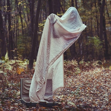
The lighting in this image is key to that perfect shadow within that wrinkly sheet. A shallow depth of field appears to be playing a big part in this image, the briefcase is in focus and so is the sheet and the person underneath it, but the background is out of focus. I think that most likely a F10 has been used to achieve this. My personal opinion of the image is that I find it very alluring, it reaches out and grabs you. At first glance, you just see a sheet in the middle of a wooded area, but when you look closer, you can see a defined person underneath the sheet, but they disappear when the sheet is no longer covering them. It's a very original idea, kind of like a classical ghost, except that's not the message McKenney was sending across. I think that the sheet is the sort of frame for the image, it's defining the person underneath the sheet.
Tommy Ingberg


I think that Ingberg's photography style is very deep and dark. I think that they are metaphors, like the man with anchor sprouting from his neck, I think it's a personification for being weighed down by memories or feelings, he's used the anchor to visualize this. His use of composition and rule of thirds is amazing. The way that he has positioned his props and his originality in his themes are extremely nerving (in a good way). I believe that his photos speak a thousand words, they speak differently to different people. Like, the one in the top left-hand corner, the man is caught between two growing trees. To me, this speaks about resentment and fear about the unknown (the future perhaps) and sometimes, holding on does more damage than letting go. The one thing that I don't like about his work is that he only focuses on the doom and gloom atmosphere, I think that if he branched out a little, he could explore a whole new theme for his work, instead of just repeating the same type of thing over and over.
Analysis

The lack of colour in this photo really gives it more depth and meaning. The composition makes the atmosphere of the image really dark and creepy. I think that Ingberg uses imagery to get across what his meaning behind the image. The man is obviously being held down by tree branches, but I think that Ingberg doesn't want us to focus on the obvious, he wants us to read into the meaning behind the branches. He's being held down by family maybe? His head is hanging low, perhaps showing us that he is upset or worried about something. My personal opinion of the image, and all of his photographs, means something different to every person. For example, to me this photo resembles resentment and worry. I think that that is what Ingberg wanted to get across, that we're all held down by something, whether that is fear, resentment, worry, whatever it is, we all carry our regrets and sadness.
Artist Research: Rene Magritte


Rene Magritte's work can be used in this project for my benefit as his works can be easily classed as Weird and Wonderful. I can choose to focus on some of his pieces to inspire my work and ideas.
Analysis

Like all of his paintings, this one doesn't make any sense. Houses of different sizes stood flush next to each other, plain, neutral colours used. The same man repeated over and over again, frozen mid-air, close and far away into the background. The picture is very flat, it lacks dimension, I will award points for originality, I've never seen a painting quite like this one, it's just that it doesn't really stand out to me. I expect a good painting to jump off of the canvas (so to speak) and this one doesn't.
The background is just plain light blue for the sky, there is a kind of cloudy mist as the sky reaches the buildings, the roofs on the houses are a red/maroon colour and the houses are kind of like a beige, the men are all wearing black bowler hats, black trench coats, black pants and black shoes. Personally, I don't really spot a focal point, but I guess if I had to select one spot that I am particularly drawn to is the building roofs.
This image just makes me feel that I need remember to bring my school uniform off of the washing line. I find that, even though his work is very abstract and original and I understand that his work has captured many peoples eyes and inspired them, his work just doesn't do that for me. To some extent, I understand that there are stories attached to his work, but people raining from the sky can only go so far before the story becomes meaningless.
My Photos That Link


My images link to Magritte's works as the lamppost behind the trees is very much like his works. I believe that these photographs link to Rene Magritte's paintings as the light from the lamppost, coming through the trees looks like Magritte's paintings where he manipulates the moon and blends day and night into one. However, I do think that the colours look a bit dull and unseen, so I'm going to edit them in Photoshop and increase the saturation and brightness so that they stand out a lot more than they do as they are now.
Edited Photographs


In Photoshop I increased the saturation, hue, lightness and shadowing to give the photographs a more realistic feel, and so that they link more to Magritte's paintings. I think that these edited images look a lot better and link a lot more seamlessly to my artist research than the unedited ones. The increased lighting and saturation makes the images appear a lot more stronger, which also makes them link back to come of Magritte's works, as he focused on bright and vibrant colours in his paintings. I played around with different colour filters in the third image of this shoot, and I managed to make the streetlight to look a bright, dark red colour, which I think makes the whole feel of the photograph more striking and intriguing. I also think that the edited images look more aesthetically pleasing.
Artist Research: Salvador Dali


Salvador Dali's work can be used in my research as his work is surreal and surrealism is a form of Weird and Wonderful. Some of his pieces can be duplicated into my own work, and I can easily be inspired by his works.
Analysis
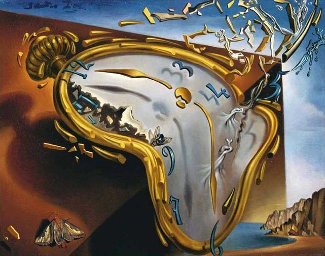
In the image above, there is a broken clock. It is melting but yet still appears to be solid. There is a moth on the left hand corner, and a fly just above the nine on the clock face. The clock itself is spurting out bits of broken metal and glass. In the background of the image, the ledge that the clock is sitting on fades away into what appears to be a beach. The cliffs that emerge from the bottom right corner run into the dark blue waters. Also the numbers and the hour and minute hands on the clock face are floating above the clock. This picture can link to our 'Weird and Wonderful' unit because it isn't anything that you would see in real life. You wouldn't see a melting clock, spurting out pieces of broken metal. The clocks numbers aren't even touching the clock face, they are just hovering above it, defying gravity. The clock face itself appears to have been pulled up and twisted round a few times. My opinion of this particular image is that it is very strange and original, it is quite eye catching as it's very unique, and it has it's own sort of laws to it as now laws of physics seem to apply (e.g. gravity). I could use Dali's work to inspire my work by using the same sense of mystery and dream-like wonder that he uses in his work.
Ideas and Themes
For my photographs, I plan to follow (at least for the first shoot) Christopher McKenney. I think that his pictures are very chilling, and they are very dark and have hidden meanings to them. I want to take some shots of someone lying down giving the appearance that they are dead, and later on in photoshop, add a slightly faded version of the person sat up in the exact same spot as the dead version. This makes it look as though the person's spirit is leaving their bodies. I'm thinking of either adding a halo to the persons spirit and add a bright white light in the top right hand corner (this will be heaven opening it's gates). Or I will have little black demons standing around the spirit, there to drag the condemned spirit to hell. McKenney's photos are very gothic, so I shall thrive to link my photos to those of his work. I have a few ideas for my second shoot, my first idea is to have someone with a sheet wrapped tightly around their face, showing their facial features and expressions. They will be screaming, and later on in photoshop I will edit out the parts of the persons body that aren't wrapped in the sheet, making it look like they are a ghost (or demon) that can only be seen when something is wrapped around them. My second idea is to have a spiral staircase heading up to the sky (based on Ingberg's work), this will be as though the staircase is heading up to space, or the unknown. I have yet to think of some ideas for my third shoot.
First Shoot: Plan
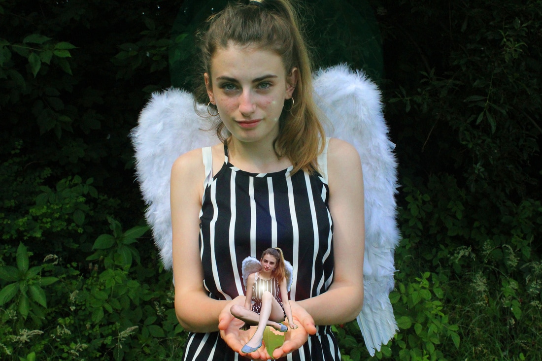
For my first shoot, I plan to experiment with the mystical and fictional. I'm going to use models to represent fairies (I will take some photos of them in various positions, and later on in Photoshop, I will edit them to make them look more like fairies), then I will take some portrait shots of someone, and later on in Photoshop, I will add the tiny fairies around the person, and cut the person into two, making one half good, one half evil. I will also add elemental occurrences in the background, to create a magical storm. The props I will use are; painted fairy/angel wings, tree stumps, fairy costumes and glitter. My friend has volunteered to be my model for this shoot, so I have everything planned out.
First Shoot


I really like this shoot as it links back to my chosen theme, which is 'fantasy'. The idea behind this shoot is that the person in the photograph is surrounded by fairies. The lighting and composition contrast very nicely with the model's outfit and wings, as they make the colours appear more vibrant and saturated. The depth of field is perfect in creating the mysterious atmosphere of the photographs, and the use of blurring various things in each image gives a wide variety of experimentation that can contain the feel that I was aiming for when I took these photographs. As I have already stated, I do like this shoot, but the theme of 'fairies' doesn't really sit well with me, so for my next shoots and overall outcome, I plan on focusing on Christopher McKenney's technique of using the sheet and layering photographs in Photoshop to create the ghost-like figure in his photographs.
Photoshop Edits


For these edits, I increased the saturation, hue and brightness to achieve a higher contrast in the pictures. My favourite edit is the one in the middle, as I believe it captures what my original idea was the most.
Photoshop Edit
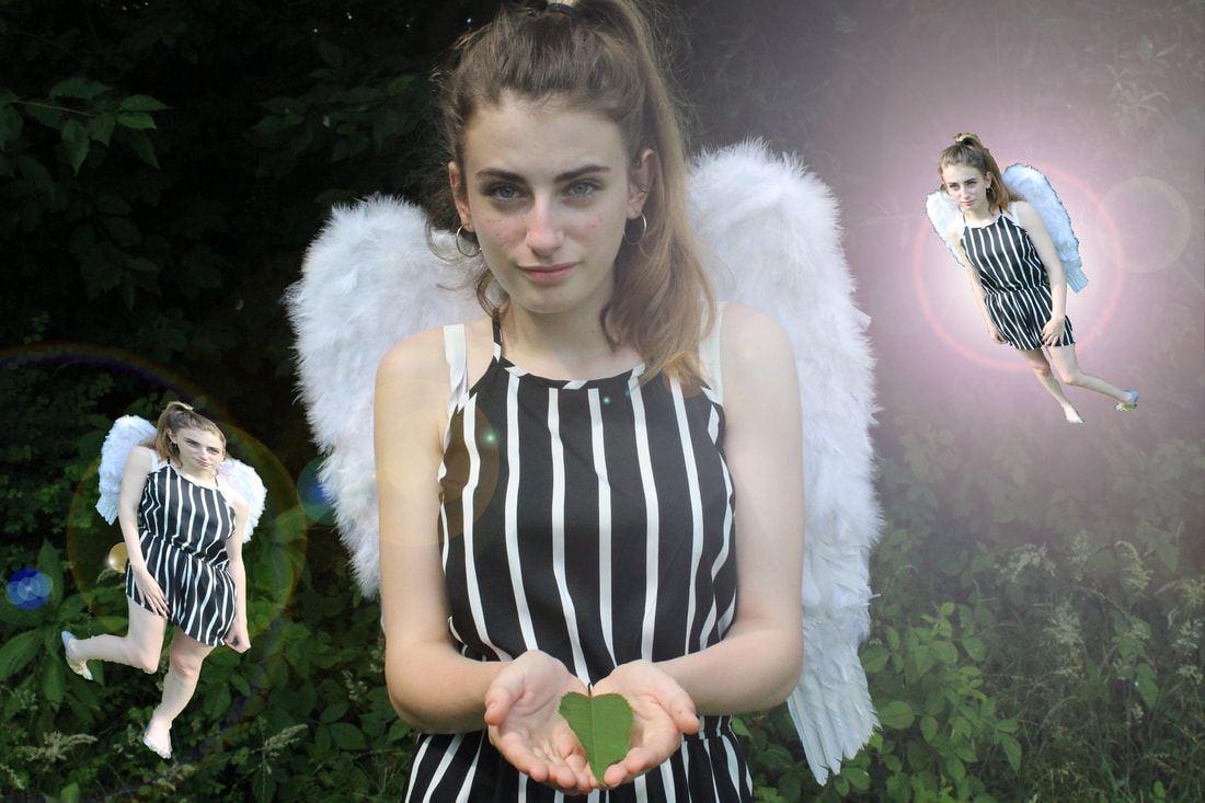
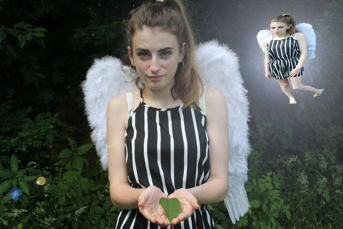
This my edit of my first shoot. I layered the pictures that I took and I shrank down the model in photoshop to make them look more like a fairy. I duplicated this effect by using a few of my pictures to create more fairies, even though they are the same person. I really like this edit, but I am still going to stick by what I said in my evaluation of my first shoot, I plan on changing my idea from 'fairies' to the ghost-like figures like in McKenney's works. However, I think that I am still going to use this final edit as one of my overall finals at the end of the project.
Photoshop Process


Development
Further Development
I decided to further develop my previous edit for multiple reasons. For starters, I forgot to screenshot the process of my editing, which makes the edit look sloppy and incomplete. Secondly, I am not a fan of the type of lens flare I have used to project the fairy in the background, I feel as though it doesn't compliment the overall edit. Lastly, I do not like the second fairy I have placed in the bottom left hand corner, as it not only makes the image look clustered, it also makes the edit look fairly basic and unoriginal.
I have furthered this edit by starting again from scratch, this time screenshotting my editing process and neatening out the rough edges of the edit itself.
I have furthered this edit by starting again from scratch, this time screenshotting my editing process and neatening out the rough edges of the edit itself.


Homework


I am going to use these pictures as backgrounds to my shoots. I am following the works of Christopher McKenney, so my plan is to take some photos of someone under a sheet, with their head going through an open picture frame. Then I will cut out the person, and paste them onto on of the pictures above, most likely one where there are leaves and twigs on the ground, with trees running throughout the background as that is how McKenney frames his photos. The lighting and composition match perfectly, as they both compliment each other. The depth of field has been set to a great standard, leaving the picture in complete focus in all the right areas. This is key for my edits as without it, the model that I plan on photo-shopping in won't match the background.
Photoshop Experimentation

Second Shoot Plan
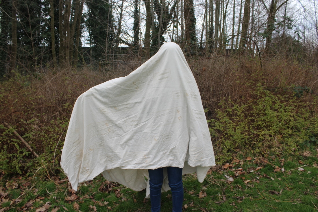
I am going to take some photographs of someone under a sheet (inspired by Christopher McKenney) and cut them out to paste them onto another one of my photos with a woodland background, just like McKenney's works. I am going to attempt to experiment with positioning and lighting to get a good idea of how I will frame the picture in my final photoshop. I also hope to use a suitcase/briefcase and have the sheet draping out of it. I know that some of the person will be visible from outside of the sheet, but that is okay as I plan on cutting around them so that only the sheet is visible when I paste it onto a new background, similar to how McKenney takes his shoots.
Second Shoot


These images link to my research on Christopher McKenney. I have implemented my own spin on McKenney's works in this shoot, by experimenting with bubble-wrap, as well as the table cloth. The problem with these photographs is that the lighting that they were taken in doesn't match the lighting of the backgrounds that I had planned to Photoshop them onto. For my next shoot, I plan on getting some more pictures with different lighting styles, so they will match my backgrounds of nature. I like the idea of using a sheet to partially cover the model, as it links back to McKenney's works. I plan on continuing down this path.
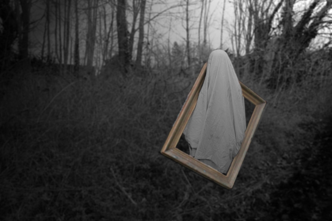
First Photoshop

This is my first completed photoshop. The edges of the sheet are a bit jagged and rough, and the light from behind the sheet that causes the outline of the persons shadow doesn't match the background. These are all things that I plan on correcting in my next photoshop. I am also going to add some more of the ghost-style people throughout the foreground and background of the image, as well as including some filters and lighting effects. I need to refine the edges of this image, and fix the lighting, but instead of re-doing this edit, I am going to branch out and think of ways to fix these problems with more ease.
Photoshop Process


AO3 Planning
For my further AO3 build up, I am going to finish off my final shoot and then complete my final outcomes. Then I will write a detailed description of how I reached my overall final piece. I am going to screenshot the process of my photoshop editing techniques. I just need to finish my third shoot, finish a couple photoshop edits and then write up my evaluation.
After I have finished my final piece, I am going to take some time working on rearranging my portfolio. It will make more sense, it will be easier to follow and it will get me a higher grade if the flow of my portfolio is smoother.
After I have finished my final piece, I am going to take some time working on rearranging my portfolio. It will make more sense, it will be easier to follow and it will get me a higher grade if the flow of my portfolio is smoother.
iPad Apps to Consider
1. Instasize
2. PhotoEditor+
3. PicCollage
4. Filterra
5. Moldiv
6. Pro Knockout
2. PhotoEditor+
3. PicCollage
4. Filterra
5. Moldiv
6. Pro Knockout
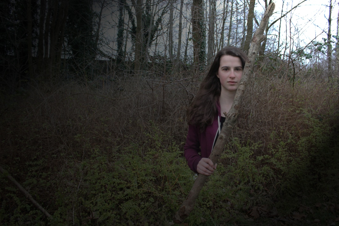
Third Shoot: Plan
The equipment I need for my next shoot are; a camera, a tripod, a brief case, a white/beige table cloth, a big stick and a large picture frame. My first idea is to have one of my friends stand with the table cloth draped over them, with the cloth looking like it is coming out of the brief case, like McKenney's pictures. My second idea is to get them going through the picture frame, looking as though they're coming out of a portrait, also like McKenney's works.
My final idea for my third shoot is quite similar to McKenney's works, but he hasn't done anything quite like this. I am going to get the person to stand completely still, holding a large stick going up diagonally up their body, later on in Photoshop I am going to cut out the person, but only from the stick upwards, and paste them onto a woodland background shot, which I also plan to take a few of mid-distance shots of a woodland area. I am going to do this shoot on the park close to school where there are plenty of woodland areas, and I am going to get some still shots of the person posing how I wish and then getting them to move out of the way and get some shots of the background, so that later on when I am editing my images, the shots of the person match the same lighting of the background so that it looks more believable and it lines up with the fine details of the background (trees, leaves, rocks, etc).
My inspiration for this idea definitely comes from McKenney's amazing photographs, but I don't just want to copy his methods and pictures, which is why I thought of this idea. I like the way that in McKenney's pictures, there is always a person under a sheet, but when the sheet lifts up, you can't see the persons body underneath it, this is why I am thinking of ideas that are based around that style and not just copying McKenney's pictures.
Third Shoot


I believe that this shoot was definitely a turning point for me. I experimented with different lighting techniques and esposure settings, as to achieve a better outcome when it comes to Photoshop.
First Photoshop

I really like how this edit came out. I think that this edit definitely links back to my photographer's research (McKenney), but I implemented my own unique spin on his original idea. I think that I am going to further this idea, and add into my next shoot, so that my final outcomes aren't just an imitation of McKenney's works.
Photoshop Process


Fourth Shoot: Plan
For my next shoot, I plan on being completely prepared. I know exactly what I'm going to do and I know what I'm going to need to achieve my ideas. I'm going to use the same large picture frame that I used in my last shoot, to link back my pictures to McKenney's works. I also plan on implementing the stick idea into this shoot as well, because I think that it shows clear understanding of linking my work back to my photographer's research, but it also has a clear unique idea applied into it. This shoot will be taken outside of school, in a park close to where I live, so that I can take background pictures, as well as model ones, that have the same ISO and lighting applied to them. This is key to my final Photoshop edits, as where it obviously needs to look mystical, it also needs to look as realistic as possible, and having the same lighting in both the background and model images, when I layer them together, they will match up.
Fourth Shoot


I took these pictures outside of school with a few of my friends as models. They link a lot better back to my chosen photographer (McKenney) and the lighting matches the new background images I took, as they were taken in the same place, at the same time of day. I plan on photo-shopping the ones with the picture frame onto one of my backgrounds, and experiment with different lighting effects and filters, to give a more eerie feel. I took a few pictures that are similar to the style of McKenney, but they have a more personal touch, so that my photographs don't look like I have completely ripped of McKenney's works.
I think that this is definitely my best shoot so far, as it is laid out clearly, and it gives me free range to experiment with my ideas and outcomes. The background images and model photos that I took in this shoot were taken with the same ISO and at the same time of day, so the lighting matches on both sets, meaning that when I Photoshop the model onto one of the background photos, they won't look out of place.
I think that this is definitely my best shoot so far, as it is laid out clearly, and it gives me free range to experiment with my ideas and outcomes. The background images and model photos that I took in this shoot were taken with the same ISO and at the same time of day, so the lighting matches on both sets, meaning that when I Photoshop the model onto one of the background photos, they won't look out of place.
First Photoshop

I really like this outcome. It links in perfectly with McKenney's works. The lighting effects I applied in Photoshop give the picture a mysterious glow, and when I took the pictures of the backgrounds and the models, I made sure that the lighting, ISO and composition were the same, otherwise when I photo-shopped the images together, the lighting wouldn't of matched and it would of made the image look really badly taken. In my next Photoshop edit, I plan on using one of the picture frame images as then I would have more final outcomes that link to my chosen photographer. I will also screenshot my process of editing next time, so I have a clear view of what I did to achieve my final outcome.
To achieve this outcome, firstly I opened both the model image and the background image. Next, I used the magnetic lasso tool to cut around the model and the stick she is holding, but cutting her in half when I reached the underside of the stick. Then, I refined the edges of the outlined model, and dragged the selected are over to the new background. Once she was positioned where I wanted her, I had to save the image as a 'jpeg' file before I attempted to add any filters or lighting effects as the model and the background were two separate layers, so it would have been hard to line up the effects on both. After I had saved it, I re-opened it and added a vignette effect to give a dark-complexion to the picture. Finally, I went around the model once more with the eraser tool to make complete sure that she looked as convincing as possible.
To achieve this outcome, firstly I opened both the model image and the background image. Next, I used the magnetic lasso tool to cut around the model and the stick she is holding, but cutting her in half when I reached the underside of the stick. Then, I refined the edges of the outlined model, and dragged the selected are over to the new background. Once she was positioned where I wanted her, I had to save the image as a 'jpeg' file before I attempted to add any filters or lighting effects as the model and the background were two separate layers, so it would have been hard to line up the effects on both. After I had saved it, I re-opened it and added a vignette effect to give a dark-complexion to the picture. Finally, I went around the model once more with the eraser tool to make complete sure that she looked as convincing as possible.
Second Photoshop

Second Photoshop Process
These images below are screen-grabs of my entire photoshop process.


This is my final outcome of my second Photoshop edit. I used a slight vignette to add the lighting effects and I blurred out the background, but left the model under the sheet in complete focus, to give a spooky feel to it. I'm going to experiment with some more filters, to link my edit to my other chosen photographer, Tommy Ingberg. It will have the same feel that McKenney's pictures have, but it will link back to another photographer.
Black & White
For this image, I kept the first photoshop (the one above this one) and put a black and white filter on it, but kept the picture frame in colour to give the image a more personal touch, so I'm not just copying the photographers I've chosen.
Fifth Shoot Plan
For my fifth shoot I plan on taking some pictures of a friends face in a white mask, with soil surrounding them. This will again link back to McKenney's works. I also have an idea to instead of using soil, use a pool of water to give a more personal touch to it. For this shoot I will require; a camera, a plain white mask, a tub/container of some sort and some water or soil. This shoot won't take me long to complete and I plan on doing it as soon as possible.
Fifth Shoot


I took these photographs so that I had more images to work with. I was inspired by McKenney's mask photograph, but instead of using soil as a background and using only a plain mask, I used a more exclusive technique by having one of my friends to stick their hand though the models hair and grab the mask. I think that this personal approach gives the image a more supernatural feel to McKenney's original photograph. The lighting is perfect, as it gives off just the right amount of shadow to the images, whilst still allowing the model to be seen distinctly. The depth of field is also set amazingly, as it gives me free range to cut around the model, as the background is out of focus, whilst the model is in focus. This also allows every feature to be seen clearly and definitively.
New Background Images


I have taken these images so that I have a wider range of backgrounds for my final outcomes. I think that it is important that I have a range of backgrounds to use, so that I'm not just using the same ones over and over again. I like the lighting in these images, as the time of day at which I took them, gives a warm and cozy feel to them, which will look good in contrast to my final outcomes that I plan on achieving. I used a range of techniques to take these images, such as; The Rule of Thirds. This technique being used gives me plenty of room to Photoshop my models onto the photo, whilst also giving the image as a whole a mysterious and gloomy feel.
Outcomes


These are my final outcomes from my shoot with a mask. I like these outcomes as they link to two of the photographers that I researched; Christopher McKenney (with the eerie, ghost sort of feel) and Tommy Ingberg (with the black and white filters). However, I have given my images a personal touch so that it doesn't appear as though I completely copied my photographers research, such as the hand coming out from behind the girl's hair, and grabbing the mask, and the different blurring techniques and lighting effects that I applied in Photoshop.
General Photoshop Overview
These screenshots are the editing process of the outcome that came from my fifth shoot. These are just the editing process of one of my outcomes, but I did virtually the same thing to each of my outcomes.


Final Outcome Edit Ideas


For these images, I edited them in Photoshop to experiment with saturation, hue, brightness and colour. I dabbled with different editing techniques that I didn't want to use before, and I think that it shows how I have improved with Photoshop editing.
Overall Final Outcomes
These are my final outcomes for this Weird and Wonderful unit. I believe that they are my best outcomes from my five shoots, as they have a clear link to my photographers research, yet they also have a personal touch that shows I have thought about the edits, and realized them on Photoshop. These photographs that have become my final outcomes have a clear link to my photographer's research, and stand out in the sense that I have applied different filters and styles to them, to make them more 'me'.


Evaluation
This year our project was 'Weird and Wonderful', and I chose the theme 'fantasy'. I thoroughly enjoyed this project as it opened up my mind to a new style of photography and different approaches to Photoshop editing techniques. Within this unit, I have experienced new ways to edit photographs (for example, how to make something that is seemingly 'unreal' appear incredibly life-like and pragmatic). I would further like to develop my understanding of photographer's intentions behind their 'Weird and Wonderful' pictures and truly understand the meaning and/or message that they are attempting to send across through their art. For this project, I researched three photographers and two artists that dabble in the 'Weird and Wonderful' area. They were; Christopher McKenney, Tommy Ingberg, Erik Johansson, Salvador Dali and Rene Magritte. My main source of inspiration during this unit was definitely Christopher McKenney. His pictures are incredibly well thought out and original, with a hint of mysterious nature, which I happen to enjoy. The technique that I love the most in McKenney's works is the use of common household objects to create illusions and tricks, for example, the use of a table cloth to create a ghost-like atmosphere.
I think that the most successful part of my process was unequivocally my edits. I believe that they certainly link back to my research (McKenney's works) , but they still have a form of originality too them. Such as my use of a stick to create a mystical feel, like what McKenney did with a table cloth and a brief case, except I took that general idea and I put my own little spin on it. I would say that the only big problem that I encountered in my project was the use of lighting in my photographs. It turned out to be quite hard to correct the lighting on my model photos to match the background images, so that when I pasted the model onto my background, it looked as though it was already like that when I took the pictures. This problem forced me to experiment with new editing techniques, which, I believe, helped shape my overall outcomes and helped me to experience new Photoshop skills that I can further develop in the near future. I think that my overall outcomes are free of faults to a certain extent. The editing is seamless, and the layers line up pretty much perfectly. However, the blurring techniques that I have used are pretty basic and unimaginative and if I was given a second chance to go back and edit these photographs, I would experiment further with blurring filters and techniques in order to achieve a more unique feel.
Overall, I thoroughly enjoyed the 'Weird and Wonderful' project, and I believe that it helped me to further my knowledge of photography.
